Firstly I would like to thank Florian for inviting me to write a guest post on his blog.
and I am a landscape photographer based in Batemans Bay, Australia.
I have always been very keen on photography, so a bit over a year ago I finished up working as a vet, sold most of what I owned, and used all my savings to buy camera gear. My website recently went live, with photos that I have taken over the past year. Feel free to check it out -
- hopefully you like them.
I have found that looking at Florian’s photos has gotten me excited about night sky photography again, and as soon as the weather obliges I will be out in the dark!
“Frozen Dawn”
This shot has been one of my most popular photos, and taking the photo was certainly one of those moments that leaves you in awe of nature and the landscape.
The morning that I took this photo, I had actually planned to go to another location, but as I drove into a small valley, the terrain opened up to reveal thick frost blanketing the ground.
As I had arrived well before dawn, I began experimenting with some close up photos of frozen plants on the side of the road while I waited for the sun to arrive. After a while I looked up to see the mist lighting up in the valley right in front of me. I quickly ran down the road to a better vantage point, shooed some alpacas out of the way, and took this shot.
The mist did not stay for long and soon dispersed - it was definitely a case of being in the right place at the right time. I drove back to the same location whenever frost was predicted for the next 3 weeks, but never saw another morning like it.
Gear
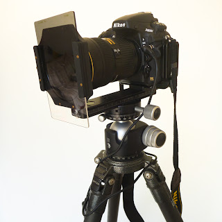
I am lucky enough to be using a Nikon d800e, I also use a Gitzo tripod with a RRS Ballhead, a RRS L plate, and a cable release. It would have been a good idea for me to have used my graduated ND (neutral density) filter for this shot, but as explained above, I had to get this shot in a hurry.
An advantage of the Nikon d800e is that it has very good dynamic range, which has saved me on multiple occasions (even though you can see some colour channel clipping on the histogram later on below in this shot). It also has enough pixels to print up to 50 inches from the single shot without losing detail.
Exposure
This exposure was f/11, 1/25th of a sec, and ISO 100. It was taken with my Nikon 24-70mm lens at 55mm, on a full frame sensor.
Technique
Generally I subscribe to the
Exposure to the Right theory, and will usually shoot with reference to the histogram, rather than worrying too much about how it looks on the camera screen.
I also shoot exclusively in RAW, as I prefer to retain maximum control over my shots.
This photo is also a single exposure - I prefer single exposures when I can, as I frequently shoot on the coast where moving waves / clouds etc often make a single capture preferable.
Post-processing
I use Lightroom and Photoshop. I like Lightroom for storage and organizing my shots, and find the Develop mode really intuitive to use. Photoshop is Photoshop - it does several things very well, but it can be difficult. I use it for re-sizing photos, changing colour space, sharpening and, when I have to, photo editing.
For “Frozen Dawn”, I imported the photo into Lightroom, cropped to a 3:1 ratio, and used the standard Lens Correction Profile on the photo. I then exported to Photoshop (with the file as a DNG or Digital Negative).
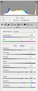
In Camera Raw, I have increased the exposure by +0.25 (even though you can see this exacerbates the red highlight clipping, most of that will be in the sky where there is no detail anyway).
I then played with Recovery, Fill light, and a small increase in Blacks.
Next I add an increase in Clarity, increased Vibrance, and a small increase in Saturation (be careful increasing saturation, often I don’t touch it at all, but in this case the colours in the photo allowed a small increase).
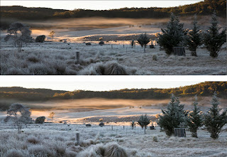
Next I try to get the colour balance right - often I will use Levels to set the white point which is what I have done in this case.
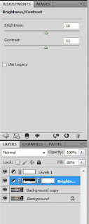
Adjusting brightness and contrast of the foreground grass is the next step. In this case I brightened and increased contrast, then used a black mask, and painted white over the mask covering the foreground grass.
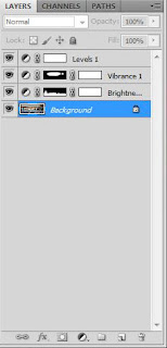
Finally, a slight selective increase in Vibrance for the mist using another mask, and it is almost finished.
My final step is to change the photo into the colour profile that I will be printing in. Colour space and colour profile can be complicated concepts - the way I look at it is - not all mediums of showing photos are able to reproduce exactly the same colours. If you would like further detail on colour spaces and colour profiles, this is a website that I have found useful
www.dpbestflow.org/color/color-space-and-color-profiles
In simple terms, pure black on your laptop will look slightly different to pure black on a several thousand dollar photographic monitor. This in turn will look different to black printed on canvas, which will look different to black printed on fine art photographic paper.

White will also look different on different media.
So will all the colours.
You need a way of being sure that what you see on your screen at home will match the print when it arrives. So, first you need to calibrate your monitor, then you need to work on your photo in an appropriate colour space. If you work in a colour space that is too small, you may lose some colours for good.
Finally, you need to get the photo looking accurate in the colour profile of the machine that does your printing. It will often make a big difference to the final result!
For me, generally I import into Lightroom which uses ProPhoto RGB, then usually export into Photoshop in AdobeRGB 16 bit, then finally convert to Lambdaflex which is my printer’s colour profile as my last step before printing. For putting photos online, I tend to save photos in the sRGB format. Sorry if that’s a little complicated!
When I first printed this photo, I noticed just a slight uneven grey in the sky, so I lightened the sky slightly to make this more uniform.
Much of this would have been avoided if I had used my graduated ND filter, but it is nice to still be able to rescue the shot when things don’t go entirely to plan!
Awards
“Frozen Dawn” received a Bronze Award in the 2012 International Loupe Awards.
"Mullimburra Dreaming"
Next I wanted to talk about, and compare two photos. They are taken about 10 minutes apart with the camera unmoved on my tripod, just as the sun was setting through thick cloud.
Photo 1
Photo 2 “Mullimburra Dreaming”
I take a lot of my photos on the coast, and I love experimenting with the look of the water and the clouds as I vary shutter speed. Shooting at dawn and dusk on the coast I find I use my graduated ND filters and my solid ND filter very regularly.
I love this location for shooting - it has a strong central point of focus, with the rocks on either side of the shot helping to draw your eye in.
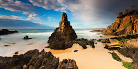
I have taken photos at this location from almost every conceivable angle - including this one!
But the angle for the main two photos is probably my favourite.
The problem with getting this angle is that you are halfway up a very steep incline, in the mud, with a sheer drop off one side - but anything goes in the name of photography right!?
These photos were also taken in intermittent heavy rain - I had to keep putting the waterproof gear on and off my equipment to try and keep it all dry.
Gear
Both images were taken with my Nikon d800e, a Nikon 16-35mm lens at 16mm, and a cable release. For both images I have used a graduated ND filter which restricts the amount of light across half the photo (in this case the lighter sky).
Often I will use a graduated ND filter to darken the sky in my photos. This allows the camera to more accurately capture all the information by reducing the dynamic range of the scene. I can then lighten the sky in post- processing (often with a graduated filter in Lightroom). In this way, I can capture good detail through the sky, but still end up with a final result that looks very close to the scene that was in front of me when I took the photo.
For the second photo, I added a solid ND filter in addition to the graduated ND filter. The solid ND filter blocks 6 stops of light, allowing the shutter to be left open much longer.
Exposure
Aperture was f/11, ISO 100, with a 2 sec exposure for the first shot, and 184 sec for the second photo.
Awards
Initially I preferred “Mullimburra Dreaming” (Photo 2), and it has recently won a Silver Award in the 2012 International Loupe Awards.
But when I sat down to write this guest blog I came across the other photo (Photo 1), and now I am having trouble deciding which photo I like best.
I ran a small poll on my
Facebook page, and Photo 1 is currently in the lead (at the time of writing).
Thanks again to Florian for inviting me to author a post for his blog. I hope it has given you some insight into how I do what I do, and I hope you like the photos!
Please feel free to leave comments / questions, or let me know which photo you prefer!


 Click Here - to see my complete new range of Lightroom Presets and 1hr long Lightroom Video Tutorial. The tutorial is filled with all the techniques and tips I use to process my images.
 Click Here - to see my complete new range of Lightroom Presets and 1hr long Lightroom Video Tutorial. The tutorial is filled with all the techniques and tips I use to process my images.
 Click Here - to see my complete new range of Lightroom Presets and 1hr long Lightroom Video Tutorial. The tutorial is filled with all the techniques and tips I use to process my images.
 Click Here - to see my complete new range of Lightroom Presets and 1hr long Lightroom Video Tutorial. The tutorial is filled with all the techniques and tips I use to process my images.


 Click Here - to see my complete new range of Lightroom 4 Presets and 1hr long Lightroom Video Tutorial. The tutorial is filled with all the techniques and tips I use to process my images.
 Click Here - to see my complete new range of Lightroom 4 Presets and 1hr long Lightroom Video Tutorial. The tutorial is filled with all the techniques and tips I use to process my images.
 Click Here - to see my complete new range of Lightroom 4 Presets and 1hr long Lightroom Video Tutorial. The tutorial is filled with all the techniques and tips I use to process my images.
 Click Here - to see my complete new range of Lightroom 4 Presets and 1hr long Lightroom Video Tutorial. The tutorial is filled with all the techniques and tips I use to process my images.
 Click Here - to see my complete new range of Lightroom 4 Presets and 1hr long Lightroom Video Tutorial. The tutorial is filled with all the techniques and tips I use to process my images.
 I am lucky enough to be using a Nikon d800e, I also use a Gitzo tripod with a RRS Ballhead, a RRS L plate, and a cable release. It would have been a good idea for me to have used my graduated ND (neutral density) filter for this shot, but as explained above, I had to get this shot in a hurry.
 In Camera Raw, I have increased the exposure by +0.25 (even though you can see this exacerbates the red highlight clipping, most of that will be in the sky where there is no detail anyway).
 Adjusting brightness and contrast of the foreground grass is the next step. In this case I brightened and increased contrast, then used a black mask, and painted white over the mask covering the foreground grass.
 Finally, a slight selective increase in Vibrance for the mist using another mask, and it is almost finished.


 I have taken photos at this location from almost every conceivable angle - including this one!
